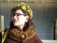
I have a rather good eye for colour (that's what happens when your mother had you mixing paint as a child, though never quite to her satisfaction) but sometimes I encounter shades that aren't quite anything. I tried taking this dress into various sources of light to determine if it was grey, beige or a dull gold and in the end, I'm still not certain. The black stripes look quite different at an arm's length, and in the end I went with another vaguely metallic shade in the bolero jacket and declared it, "Good enough." Black would have been the easier choice, for certain but then where's the fun in that? Sometimes I suspect items like these are donated largely unworn as they are so difficult to coordinate. A pop of colour would have been nice (teal perhaps?) but there's only so much time I'm willing to devote to getting dressed.
Belt? Gold? Silver? Black? Aw, screw it, that's too complicated. I'll wear it as intended in the 80's, though I did remove the shoulder pads.

It was a good day to wear something that forces me to think about colour as we went to see the In Living Colour, Andy Warhol and Contemporary Printmaking at the Joslyn. There were precious few Warhols on exhibit, but I don't suppose you'd get people to fork over ten bucks and queue to see a Diebenkorn or a Baldessari. Not in Omaha, anyway. That said, the collection was interesting to see in such a small space. The upstairs gallery is divided in such a way that it isn't unlike a loft with haphazard room dividers. I frequently feel claustrophobic in there, and I don't think it benefits many of the larger works being presented, however given the smaller scale of several of these prints it seemed to work. It would have been nicer to approach the works from a bit more of a distance, Having a large video projection in one of the galleries opposite the Warhol Marilyn prints was distracting and strange. I would have like to view the Marilyns from a bit more than 3 ft. away, but I would have stumbled over a bench placed to watch the projection opposite.
Whether intentional or not, the cast from the video combined with the darkness in the gallery shifted the colours of the Warhol Marilyns, particularly the one where her face is aqua. Grey? Pewter? Turquoise? I couldn't tell, though my mind was desperately trying to compensate what I *knew* to be the colour of the print. I looked down at my sleeve and saw the stripes take on a rose hue, not unlike the effect of a black light. Back in the better lit gallery, the stripes returned to their nondescript beige/grey/gold.
Understanding the science is one thing, but no one (that I know) thinks about wavelengths when getting dressed in the morning, though they may perhaps think about gallery lighting. I don't care if light degrades my 80's striped dress though, so I made sure to get some good photographs in my well-lit bathroom before leaving.
Outfit Particulars:
1980's Dawn Joy rayon dress (I typically wear it open as a jacket) Goodwill
Metallic bolero jacket-Goodwill
Wooden/lacquer bangle-Pier One decades ago
1950's Niello earrings-Thrift World
Napier brooch-Sarpy County Historical Society Sale
Fragrance-Shalimar
Why yes, that *is* a damn good home haircut! Thanks for noticing.
The printmaking runs through the 6th of January, so if you're in Omaha (or nearby) and wish to see it, time is running out. Admission to the exhibit is $10.00 for adults, and children are free. General admission to the museum is free for the next couple of years thanks to a grant. Just don't expect too many Warhols.


5 comments:
Excellent haircut, I do the odd trim and then my lovely young hairdresser pretends not to notice my hacking. I rather like the bolero, nice colour and perfect over your 80s striped number. You have got me thinking what could be happening in our Museum at the moment, bound to be and exhibition that will tickle my fancy.
I've had a similar experience with a pair of velvet trousers that are pewter/gray/purplish brown, depending upon the light. Calling them "taupe" and wearing them with blacks seems to work for this color coward. What really puts my eyes in a tizzy is matching navy blues...
@Sue
The kind woman that cuts Danny's hair always looks at me with a face that seems to say, "You know, I could fix what you've done to yourself" but so far we've just left it unspoken.
@Beth
Mr. ETB gave up on navy years ago and just started buying all black because he couldn't tell. With socks, he just buys all the same pair to avoid any hassles matching. When they start wearing out, they get tossed and a new set is purchased.
Stay warm-our crazy weather is headed East, and you're next in line for it. -30 wind chills? Blech.
I'm pretty hopeless with colours. The kids accuse me of being colour blind - I'm not, I just get some shades of blue and green confused, and find some colours hard to identify, as your dress so neatly exemplifies. I'd just pair it with red, I think, and not worry too much!
Your hair looks great! xxx
@Curtise
Kids just don't appreciate their good vision (and hearing).
Thank you (about the hair).
You always look well-matched to me, btw.
Post a Comment